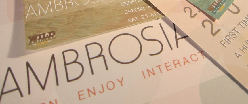
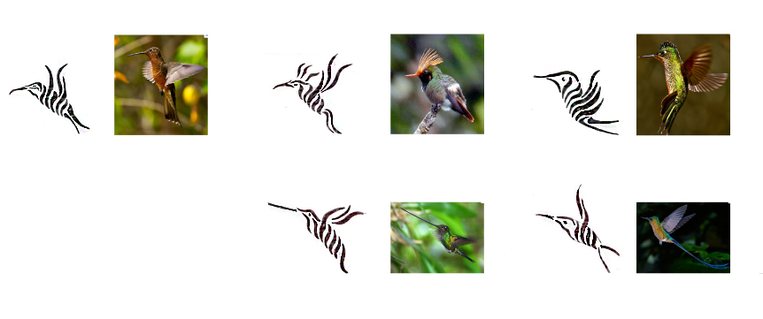
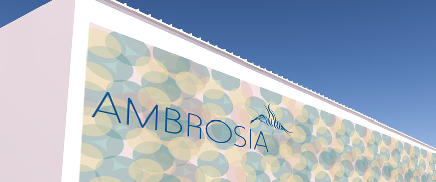
The Idea for this project is to create a branding system for a Hummingbird exhibition that would take place in the Wild Animal Park. The main focus for this project is the icons originally created from actual photographs of hummingbirds. The inspiration for the branding name is derived from research focusing on, what makes hummingbirds live? Nektrar, granulated sugar and boiling water. “Ambrosia”- sweet liquid in flowers” is the food or drink of the Greek gods, which provides immortality. The colors used are pastel colors, they are gentle and beautiful to represent the uniqueness, the beauty of the hummingbird and their variety of their species. Hummingbirds are the fastest birds, and the designs used, depicts their movement.
The design for this project is meant people feel peaceful, happy and enthusiastic towards nature. It brings a unique look to an actual hummingbird. The choice of creating the icons with lines is to create a cohesive system of different types of Hummingbirds. The lines add smoothness and movement to the bird.
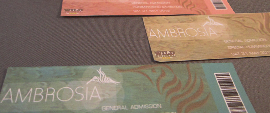
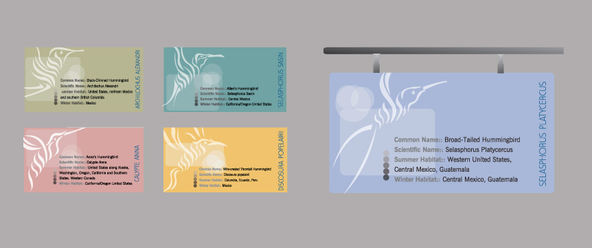
The events tickets are carefully designed. The icon is placed large on the right hand side to obtain an immediate reaction from the viewer. The colors are chosen carefully, as the designated colors of the exhibition, from the same color family of the whole exhibition. Texture is added on the background to get a natural feeling of an accrual bird rather than just looking at an icon.
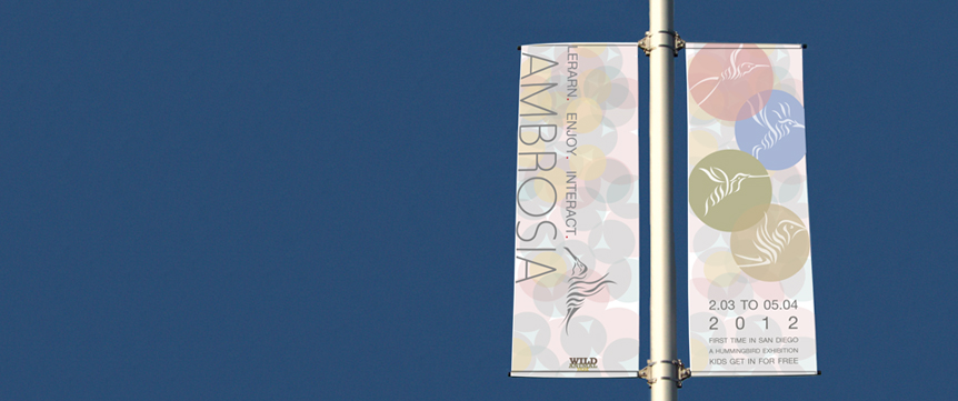
Light Pole Banner
This signs describes origin, scientific name, summer habitat and winter habitat of each bird. Using a san serif font for clarity. Again including the icon at a large scale to make a connection and to know which hummingbird exhibition one is about to see.
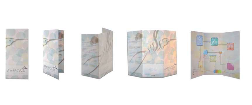
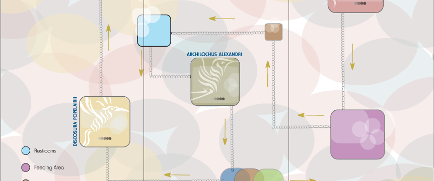
The brochure is designed as a Z-fold brochure. It includes information about hummingbirds on the right flap, fun facts on the other flap, a way finding
map designed carefully with bright colors and includes the hummingbirds icons so people can clearly find their way around and identify where each
hummingbird is exhibited. 2
Brochure Detail Photo: The colors scheme used in this brochure related to the whole branding of Ambrosia using dynamic circles to represent the beauty and movement of the hummingbirds