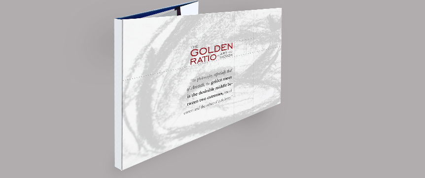
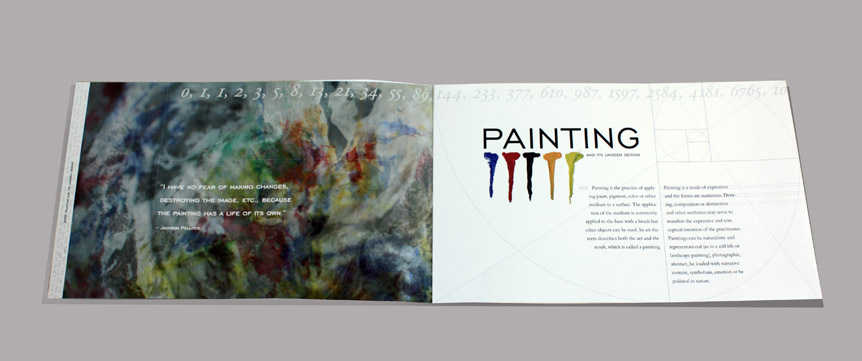
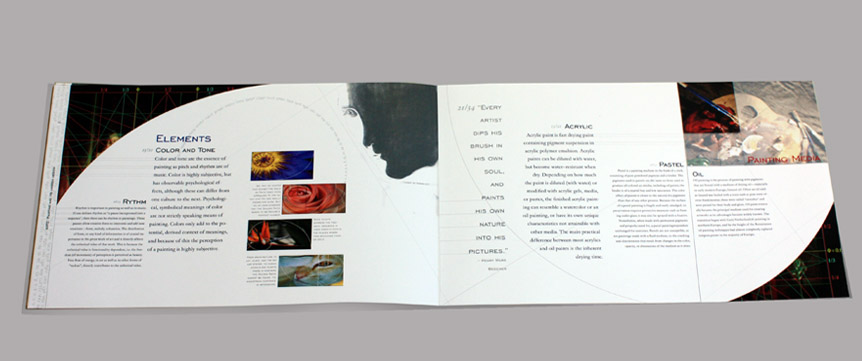
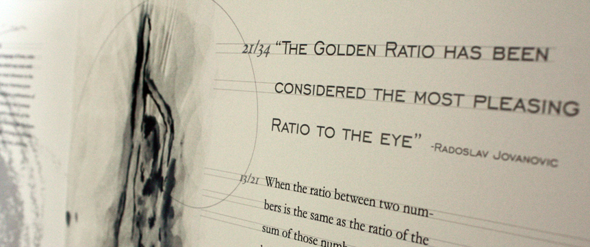
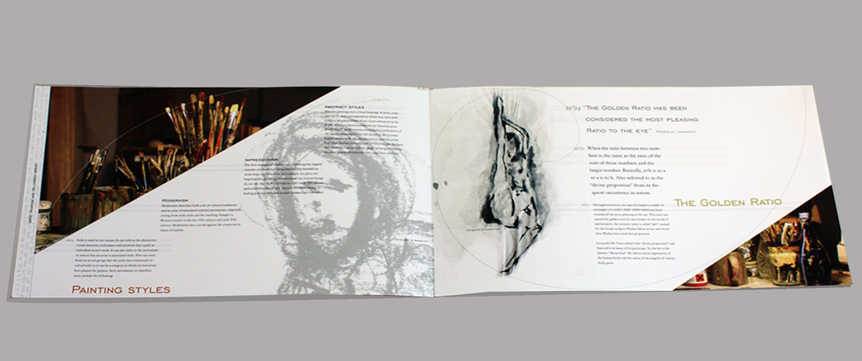
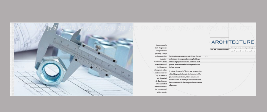
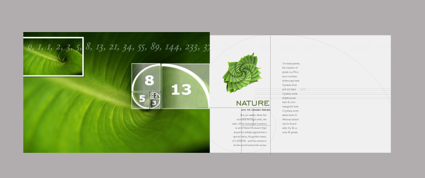
This book is designed typographically with dimensions, proportions and content all based on the Golden Section. The idea for this project is to create a book in which typography itself makes the design of the layout unique and appealing. Using creativity and imagination the type of each layout relates to the numbers of the Fibonacci sequence. With the use of a modular grid the book layouts are dynamic, each being completely different, all in a non-traditional grid use. This book contains three chapters all relating to the mysterious yet captivating dimensions of the unseen design of the Golden Section. The first chapter is about the golden section in painting, the second chapter talks about the golden section in architecture and the third chapter talks about the golden section in nature. The drawings and paintings used throughout this magazine are drawn in charcoal, ink and pastels by me. The paintings and drawings where chosen carefully to match the theme of the golden section and art. The magazine’s concept, layout and design is based on the ratio of the Golden Section and the Fibonacci series. The root three ratio is the basis for the page size, 8” x 13”. The leading and point size are based on the Fibonacci sequence; 8/13, 13/21, and 21/34.